
UX/UI DESIGNER
Legacy
Legacy is an end-of-life planning (EOLP) mobile app that I designed for a client project at Generate. My team developed the user interface, branding, and visual elements for Legacy. I worked as one of five software designers, spearheading a few main features: home page, task flow, and marketplace.
Legacy helps to automate EOLP for millennials, helping users with emotional, legal, financial, and healthcare aspects of the process. It generates customized plans that are broken up into bite-size tasks, providing a document storage vault and a marketplace of counselors, death doulas, therapists, financial planners, and attorneys that best fit the user. The platform simplifies EOLP for its users and provides peace of mind by gently guiding them through the process with catered tasks and suggestions.
"Everyone knows death is inevitable - but no one knows how to actually plan for it in an cohesive, affordable and accessible way."
Shivanjali Singh, Founder of Legacy
Building a Brand
Legacy, less stress, more life
As a collaborative team of five designers, we built Legacy's brand from scratch. Our inspiration drew from the natural organic forms and rich palette found in nature. Rooted in earthiness, our brand resonates with a grounded aesthetic that seamlessly aligns with the Legacy's overarching concept, symbolizing the natural cycles of life.


Research & Personas
As part of our research, I led the design of persona cards based on client-provided descriptions, aiming to gain deeper insights into the potential users of Legacy. I organized the data by color-coding paragraph descriptions according to categories such as personality, mentality, and logistics. Each category was then strategically ordered into lists from least to most extreme. Each persona was visually represented using different scales, enhancing readability and offering valuable functional insights.


FEATURE 1
Task Flow & Home Page
After completing the onboarding questionnaire, the user's responses will be mapped to one of several premade plans. Each plan comprises a series of tasks that users can progress through and complete. This flow also serves as Legacy's homepage.
REQUIREMENTS
- Including task progression gamification (progress bar)
- Next 3-4 steps
- Show suggested content
- See guides and see files page
User Flow
Understanding the user flow for the task progression page was crucial in establishing connections with the guides and marketplace pages. Despite the straightforward nature of this flow, I realized that there were numerous tasks which emphasized the need to ensure the homepage was concise to avoid overwhelming users.

Lo-fis
These lo-fis represent the initial phase of design for the app. The variations in spacing and components across different iterations highlight the process of refining these elements. These lo-fi designs set the standard for the entire app. I focused on creating components for text fields and determining the use of bottom pop-ups. It's worth noting that the navigation bar had not been designed at this stage.

Hi-fis
My lo-fi designs evolved with the integration of Legacy's branding, allowing me to solidify our application colors and strike a balance between playfulness and seriousness. Experimenting with outlines, drop shadows, and colors, I transformed components into card-style elements for tasks and guides, steering away from plain text to infuse a less serious feel. Creating clickable components without a hover state posed a challenge, urging us to question user intuitiveness. Another hurdle involved designing text fields suitable for both short and long content. Multiple iterations explored background colors, outlines, and corner rounding.

Prototype
I developed a prototype enabling users to effortlessly access and monitor their tasks.
Please note the provided text is intended solely for illustrative purposes as the client did not provide any content.

FEATURE 2
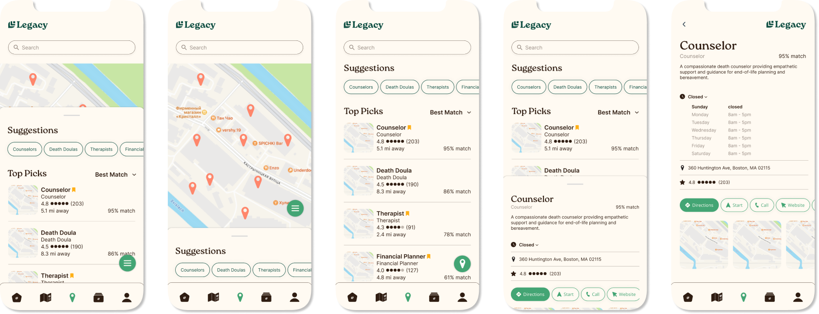
Marketplace
The primary objective of the marketplace page is to help users locate and connect to nearby resources such as death doulas or notary services. They can receive suggestions tailored to their needs, conduct specific searches for services, and curate a list of favorites based on their preferences.
REQUIREMENTS
- Homescreen that displays map and suggested resources
- Search function
- List and map view of resources
User Flow
The user flow for this feature was fairly straightforward including standard action items commonly found in map applications. However, a deliberate decision was made to streamline the user experience by limiting certain functionalities. The intent was to facilitate a smooth handoff to the user’s preferred external map application, as these pages were designed to ultimately connect users to them.

Lo-fis
In designing these lo-fis, I prioritized user customization, enabling seamless flipping between map and list views. To achieve this, I introduced a bottom pop-up for suggestions, allowing users to effortlessly switch between the list and map views based on preferences. Drawing inspiration from intuitive interfaces like Apple and Google Maps, the visual design of business profiles aimed to create a familiar navigation experience for users.

Hi-fis
Designing these hi-fis was relatively smooth as many components were already designed. The key change from the lo-fis involved switching to components used in other features. My primary focus was on ensuring consistency across these pages and the rest of the app, particularly in how we filtered lists and used tags.
Prototype
I created a prototype featuring a seamless transition to both map and list views, complemented by a tagging feature that enhances user search filtering.
Please not again that the provided text is intended solely for illustrative purposes as the client did not provide any content.
Takeaways
My time at Legacy served as a continuous design boot camp, presenting new tasks I never encountered. A pivotal learning experience involved collaborating with a client unfamiliar with design language. To bridge the communication gap, we showcased numerous feature iterations, emphasizing visual demonstration over verbal communication. This challenge required adept problem-solving to harmonize the client's needs with our design principles, striking a delicate balance between their vision and our creative direction. Effectively guiding the client through the design process became a daily practice, demanding both adaptability and creative stewardship.
An important thing to note about our user testing is that the user group identified by our client proved to be unresponsive and exceptionally small, preventing us from conducting extensive user testing. Despite our efforts to engage this specific group, the limited response posed a challenge in gathering comprehensive user feedback and insights. In response, we collaborated with other designers within our product development studio gathering valuable insights and perspectives. This collaborative approach allowed us to leverage internal expertise and iterate on our designs, ensuring a well-rounded and informed decision-making process.
© 2023 Emma Pon
Boston, MA | New York, NY pon.e@northeastern.edu